Four ways to quantify synchrony between time series data

Airplanes flying in synchrony, photo by Gabriel Gusmao on Unsplash
This post was also published in Towards Data Science at Medium
Sample code and data to compute synchrony metrics including Pearson correlation, time-lagged cross correlations, dynamic time warping, and instantaneous phase synchrony.
In psychology, synchrony between individuals can be an important signal that provides information about the social dynamics and potential outcomes of social interactions. Synchrony between individuals has been observed in numerous domains including bodily movement (Ramseyer & Tschacher, 2011), facial expressions (Riehle, Kempkensteffen, & Lincoln, 2017), pupil dilations (Kang & Wheatley, 2015), and neural signals (Stephens, Silbert, & Hasson, 2010). However, the term synchrony can take on many meanings as there are various ways to quantify synchrony between two signals.
In this article, I survey the pros and cons of some of the most common synchrony metrics and measurement techniques including the Pearson correlation, time lagged cross correlation (TLCC) and windowed TLCC, dynamic time warping, and instantaneous phase synchrony. To illustrate, the metrics are calculated using sample data in which smiling facial expressions were extracted from a video footage of two participants engaging in a 3 minute conversation (screenshot below). To follow along, feel free to download the sample extracted face data and the Jupyter notebook containing all the example codes.
Outline
- Pearson correlation
- Time Lagged Cross Correlation (TLCC) & Windowed TLCC
- Dynamic Time Warping (DTW)
- Instantaneous phase synchrony
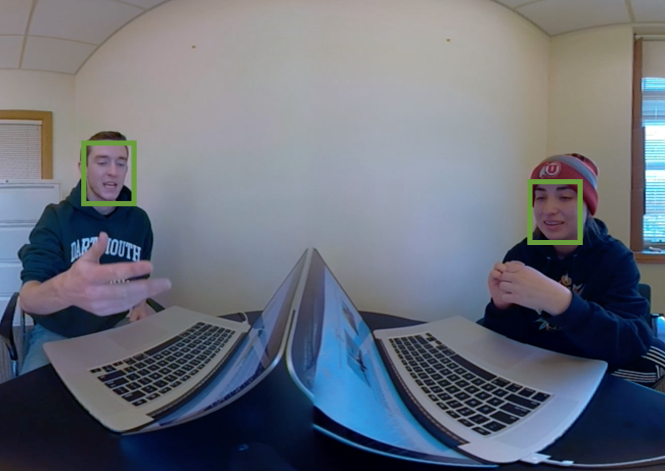
Sample data is the smiling facial expression between two participants having a conversation.
1. Pearson correlation — simple is best
The Pearson correlation measures how two continuous signals co-vary over time and indicate the linear relationship as a number between -1 (negatively correlated) to 0 (not correlated) to 1 (perfectly correlated). It is intuitive, easy to understand, and easy to interpret. Two things to be cautious when using Pearson correlation is that 1) outliers can skew the results of the correlation estimation and 2) it assumes the data are homoscedastic such that the variance of your data is homogenous across the data range. Generally, the correlation is a snapshot measure of global synchrony. Therefore it does not provide information about directionality between the two signals such as which signal leads and which follows.
The Pearson correlation is implemented in multiple packages including Numpy, Scipy, and Pandas. If you have null or missing values in your data, correlation function in Pandas will drop those rows before computing whereas you need to manually remove those data if using Numpy or Scipy’s implementations.
The following code loads are sample data (in the same folder), computes the Pearson correlation using Pandas and Scipy and plots the median filtered data.
import pandas as pd
import numpy as np
%matplotlib inline
import matplotlib.pyplot as plt
import seaborn as sns
import scipy.stats as stats

df = pd.read_csv('synchrony_sample.csv')
overall_pearson_r = df.corr().iloc[0,1]
print(f"Pandas computed Pearson r: {overall_pearson_r}")
# out: Pandas computed Pearson r: 0.2058774513561943

r, p = stats.pearsonr(df.dropna()['S1_Joy'], df.dropna()['S2_Joy'])
print(f"Scipy computed Pearson r: {r} and p-value: {p}")
# out: Scipy computed Pearson r: 0.20587745135619354 and p-value: 3.7902989479463397e-51

# Compute rolling window synchrony
f,ax=plt.subplots(figsize=(7,3))
df.rolling(window=30,center=True).median().plot(ax=ax)
ax.set(xlabel='Time',ylabel='Pearson r')
ax.set(title=f"Overall Pearson r = {np.round(overall_pearson_r,2)}");
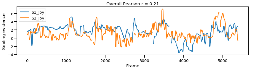
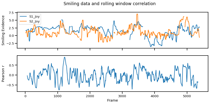
Once again, the Overall Pearson r is a measure of global synchrony that reduces the relationship between two signals to a single value. Nonetheless there is a way to look at moment-to-moment, local synchrony, using Pearson correlation. One way to compute this is by measuring the Pearson correlation in a small portion of the signal, and repeat the process along a rolling window until the entire signal is covered. This can be somewhat subjective as it requires arbitrarily defining the window size you’d like to repeat the procedure. In the code below we use a window size of 120 frames (~4 seconds) and plot the moment-to-moment synchrony in the bottom figure.
# Set window size to compute moving window synchrony.
r_window_size = 120
# Interpolate missing data.
df_interpolated = df.interpolate()
# Compute rolling window synchrony
rolling_r = df_interpolated['S1_Joy'].rolling(window=r_window_size, center=True).corr(df_interpolated['S2_Joy'])
f,ax=plt.subplots(2,1,figsize=(14,6),sharex=True)
df.rolling(window=30,center=True).median().plot(ax=ax[0])
ax[0].set(xlabel='Frame',ylabel='Smiling Evidence')
rolling_r.plot(ax=ax[1])
ax[1].set(xlabel='Frame',ylabel='Pearson r')
plt.suptitle("Smiling data and rolling window correlation")
Overall, the Pearson correlation is a good place to start as it provides a very simple way to compute both global and local synchrony. However, this still does not provide insights into signal dynamics such as which signal occurs first which can be measured via cross correlations.
2. Time Lagged Cross Correlation — assessing signal dynamics
Time lagged cross correlation (TLCC) can identify directionality between two signals such as a leader-follower relationship in which the leader initiates a response which is repeated by the follower. There are couple ways to do investigate such relationship including Granger causality, used in Economics, but note that these still do not necessarily reflect true causality. Nonetheless we can still extract a sense of which signal occurs first by looking at cross correlations.
def crosscorr(datax, datay, lag=0, wrap=False):
    """ Lag-N cross correlation.
    Shifted data filled with NaNs

    Parameters
    ----------
    lag : int, default 0
    datax, datay : pandas.Series objects of equal length
    Returns
    ----------
    crosscorr : float
    """
    if wrap:
        shiftedy = datay.shift(lag)
        shiftedy.iloc[:lag] = datay.iloc[-lag:].values
        return datax.corr(shiftedy)
    else:
        return datax.corr(datay.shift(lag))

d1 = df['S1_Joy']
d2 = df['S2_Joy']
seconds = 5
fps = 30
rs = [crosscorr(d1,d2, lag) for lag in range(-int(seconds*fps-1),int(seconds*fps))]
offset = np.ceil(len(rs)/2)-np.argmax(rs)
f,ax=plt.subplots(figsize=(14,3))
ax.plot(rs)
ax.axvline(np.ceil(len(rs)/2),color='k',linestyle='--',label='Center')
ax.axvline(np.argmax(rs),color='r',linestyle='--',label='Peak synchrony')
ax.set(title=f'Offset = {offset} frames\nS1 leads <> S2 leads',ylim=[.1,.31],xlim=[0,300], xlabel='Offset',ylabel='Pearson r')
ax.set_xticklabels([int(item-150) for item in ax.get_xticks()])
plt.legend()
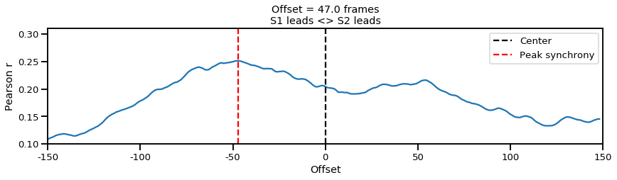
In the plot above, we can infer from the negative offset that Subject 1 (S1) is leading the interaction (correlation is maximized when S2 is pulled forward by 47 frames). But once again this assesses signal dynamics at a global level, such as who is leading during the entire 3 minute period. On the other hand we might think that the interaction may be even more dynamic such that the leader follower roles vary from time to time.
To assess the more fine grained dynamics, we can compute the windowed time lagged cross correlations (WTLCC). This process repeats the time lagged cross correlation in multiple windows of the signal. Then we can analyze each window or take the sum over the windows would provide a score comparing the difference between the leader follower interaction between two individuals.
# Windowed time lagged cross correlation
seconds = 5
fps = 30
no_splits = 20
samples_per_split = df.shape[0]/no_splits
rss=[]
for t in range(0, no_splits):
    d1 = df['S1_Joy'].loc[(t)*samples_per_split:(t+1)*samples_per_split]
    d2 = df['S2_Joy'].loc[(t)*samples_per_split:(t+1)*samples_per_split]
    rs = [crosscorr(d1,d2, lag) for lag in range(-int(seconds*fps-1),int(seconds*fps))]
    rss.append(rs)
rss = pd.DataFrame(rss)
f,ax = plt.subplots(figsize=(10,5))
sns.heatmap(rss,cmap='RdBu_r',ax=ax)
ax.set(title=f'Windowed Time Lagged Cross Correlation',xlim=[0,300], xlabel='Offset',ylabel='Window epochs')
ax.set_xticklabels([int(item-150) for item in ax.get_xticks()]);

# Rolling window time lagged cross correlation
seconds = 5
fps = 30
window_size = 300 #samples
t_start = 0
t_end = t_start + window_size
step_size = 30
rss=[]
while t_end < 5400:
    d1 = df['S1_Joy'].iloc[t_start:t_end]
    d2 = df['S2_Joy'].iloc[t_start:t_end]
    rs = [crosscorr(d1,d2, lag, wrap=False) for lag in range(-int(seconds*fps-1),int(seconds*fps))]
    rss.append(rs)
    t_start = t_start + step_size
    t_end = t_end + step_size
rss = pd.DataFrame(rss)

f,ax = plt.subplots(figsize=(10,10))
sns.heatmap(rss,cmap='RdBu_r',ax=ax)
ax.set(title=f'Rolling Windowed Time Lagged Cross Correlation',xlim=[0,300], xlabel='Offset',ylabel='Epochs')
ax.set_xticklabels([int(item-150) for item in ax.get_xticks()]);
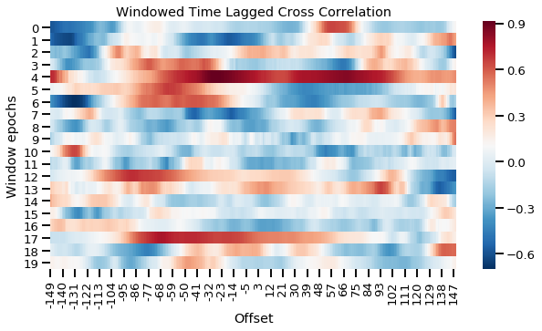
Windowed time lagged cross correlation for discrete windows
The plot above splits the time series into 20 even chunks and computes the cross correlation in each window. This gives us a more fine-grained view of what is going on in the interaction. For example, in the first window (first row), the red peak to the right suggests S2 initially leads the interaction. However by the third or fourth window (row), we can see that S1 starts to lead the interaction more. We can also compute this continuously resulting in a smoother plot as shown below.
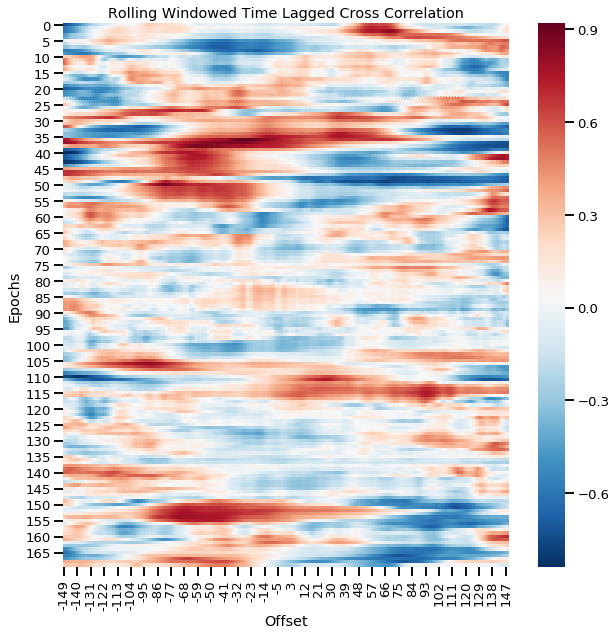
Rolling window time lagged cross correlation for continuous windows
Time lagged cross correlations and windowed time lagged cross correlations are a great way to visualize the fine-grained dynamic interaction between two signals such as the leader-follower relationship and how they shift over time. However, these signals have been computed with the assumption that events are happening simultaneously and also in similar lengths which is covered in the next section.
3. Dynamic Time Warping — synchrony of signals varying in lengths
Dynamic time warping (DTW) is a method that computes the path between two signals that minimize the distance between the two signals. The greatest advantage of this method is that it can also deal with signals of different length. Originally devised for speech analysis (learn more in this video), DTW computes the euclidean distance at each frame across every other frames to compute the minimum path that will match the two signals. One downside is that it cannot deal with missing values so you would need to interpolate beforehand if you have missing data points.
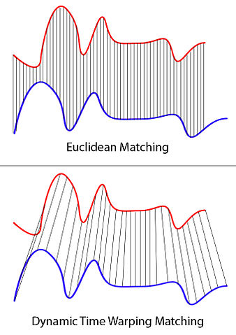
XantaCross [CC BY-SA 3.0 (https://creativecommons.org/licenses/by-sa/3.0)]
To compute DTW, we will use the dtw Python package which will speed up the calculation.
from dtw import dtw,accelerated_dtw

d1 = df['S1_Joy'].interpolate().values
d2 = df['S2_Joy'].interpolate().values
d, cost_matrix, acc_cost_matrix, path = accelerated_dtw(d1,d2, dist='euclidean')

plt.imshow(acc_cost_matrix.T, origin='lower', cmap='gray', interpolation='nearest')
plt.plot(path[0], path[1], 'w')
plt.xlabel('Subject1')
plt.ylabel('Subject2')
plt.title(f'DTW Minimum Path with minimum distance: {np.round(d,2)}')
plt.show()
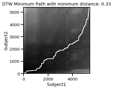
Here we can see the minimum path shown in the white convex line. In other words, earlier Subject2 data is matched with synchrony of later Subject1 data. The minimum path cost is d=.33 which can be compared with that of other signals.
4. Instantaneous phase synchrony.
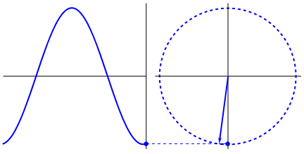
Lastly, if you have a time series data that you believe may have oscillating properties (e.g. EEG, fMRI), you may also be able to measure instantaneous phase synchrony. This measure also measures moment-to-moment synchrony between two signals. It can be somewhat subjective because you need to filter the data to the wavelength of interest but you might have theoretical reasons for determining such bands. To calculate phase synchrony, we need to extract the phase of the signal which can be done by using the Hilbert transform which splits the signal into its phase and power (learn more about Hilbert transform here). This allows us to assess if two signals are in phase (moving up and down together) or out of phase.
Gonfer at English Wikipedia [CC BY-SA 3.0 (https://creativecommons.org/licenses/by-sa/3.0)]
from scipy.signal import hilbert, butter, filtfilt
from scipy.fftpack import fft,fftfreq,rfft,irfft,ifft
import numpy as np
import seaborn as sns
import pandas as pd
import scipy.stats as stats
def butter_bandpass(lowcut, highcut, fs, order=5):
    nyq = 0.5 * fs
    low = lowcut / nyq
    high = highcut / nyq
    b, a = butter(order, [low, high], btype='band')
    return b, a


def butter_bandpass_filter(data, lowcut, highcut, fs, order=5):
    b, a = butter_bandpass(lowcut, highcut, fs, order=order)
    y = filtfilt(b, a, data)
    return y

lowcut  = .01
highcut = .5
fs = 30.
order = 1
d1 = df['S1_Joy'].interpolate().values
d2 = df['S2_Joy'].interpolate().values
y1 = butter_bandpass_filter(d1,lowcut=lowcut,highcut=highcut,fs=fs,order=order)
y2 = butter_bandpass_filter(d2,lowcut=lowcut,highcut=highcut,fs=fs,order=order)

al1 = np.angle(hilbert(y1),deg=False)
al2 = np.angle(hilbert(y2),deg=False)
phase_synchrony = 1-np.sin(np.abs(al1-al2)/2)
N = len(al1)

# Plot results
f,ax = plt.subplots(3,1,figsize=(14,7),sharex=True)
ax[0].plot(y1,color='r',label='y1')
ax[0].plot(y2,color='b',label='y2')
ax[0].legend(bbox_to_anchor=(0., 1.02, 1., .102),ncol=2)
ax[0].set(xlim=[0,N], title='Filtered Timeseries Data')
ax[1].plot(al1,color='r')
ax[1].plot(al2,color='b')
ax[1].set(ylabel='Angle',title='Angle at each Timepoint',xlim=[0,N])
phase_synchrony = 1-np.sin(np.abs(al1-al2)/2)
ax[2].plot(phase_synchrony)
ax[2].set(ylim=[0,1.1],xlim=[0,N],title='Instantaneous Phase Synchrony',xlabel='Time',ylabel='Phase Synchrony')
plt.tight_layout()
plt.show()
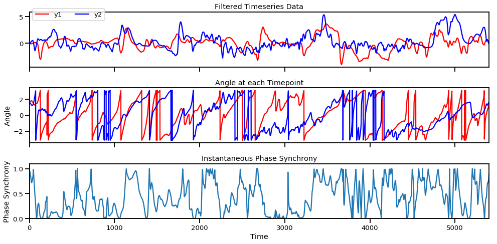
Filtered time series (top), angle of each signal at each moment in time (middle row), and instantaneous phase synchrony measure (bottom).
The instantaneous phase synchrony measure is a great way to compute moment-to-moment synchrony between two signals without arbitrarily deciding the window size as done in rolling window correlations. If you’d like to know how instantaneous phase synchrony compares to windowed correlations, check out my earlier blog post here.
Conclusion
Here we covered four ways to measure synchrony between time series data: Pearson correlation, time lagged cross correlations, dynamic time warping, and instantaneous phase synchrony. Deciding the synchrony metric will be based on the type of signal you have, the assumptions you have about the data, and your objective in what synchrony information you’d like from the data. Feel free to leave any questions or comments below!
See all the code in a Jupyter Notebook and use with the sample data available here.
machine-learning python data-science synchrony tutorials