Why models with significant variables can be useless predictors

Photo by Rakicevic Nenad from Pexels
Significant variables in a statistical model does not guarantee prediction performance
This post was also published in Towards Data Science at Medium
One of the first things you learn (or should learn) in a data science or experimental science program is the difference between explanation models and prediction models. Explanation models test relationships between variables such as whether they significantly covary or if there is a significant numerical difference between groups. On the other hand, prediction models focus on how well a trained model can estimate the outcome that was not used in training.
Unfortunately, the two types of modeling are often conflated such as describing an independent variable in a regression model as “predicting” the dependent variable. Researchers who focus on statistical modeling may also assume that high significance (e.g. p<.001) in their variables may be an indicator of prediction ability of the model. This confusion permeates not only in the social sciences but also in other scientific disciplines such as genetics and neuroscience.
One of the reasons why so many researchers still conflate the two could be that they often learn the difference via text examples instead of numerical examples. To once and for all show why significance in a model does not guarantee model prediction, here is a quick simulation that creates a synthetic dataset to show how a significant variables in a hypothesis testing model may not be useful in predicting actual outcomes.
First of all, let’s load up the required libraries and generate some synthetic data. We can easily do this using sci-kit learn’s make_classification function. We intentionally make the classification difficult by flipping a bunch of y labels. There will be 1000 samples and 3 features of which 3 will be informative in their relationship to the y variable (0 and 1). We also split our artificial data into training and a testing set.
%matplotlib inline
%config InlineBackend.figure_format = 'retina'

import numpy as np, pandas as pd, matplotlib.pyplot as plt
from sklearn.datasets import make_classification
from sklearn.model_selection import train_test_split

# Generate synthetic data
X,y = make_classification(n_samples=1000, n_features=3, n_informative=3, n_redundant=0,
                          n_classes=2, n_clusters_per_class=1, flip_y=.8, random_state=2018)
colnames = ['X'+str(col) for col in range(X.shape[1])]

# Split the data into Training and Testing set
X_train, X_test, y_train, y_test = train_test_split(X,y, test_size=.2, random_state=1)

df_train = pd.DataFrame(np.concatenate([X_train,np.expand_dims(y_train,axis=1)],axis=1), columns = np.concatenate([colnames,['y']]))
df_test = pd.DataFrame(np.concatenate([X_test,np.expand_dims(y_test,axis=1)],axis=1), columns = np.concatenate([colnames,['y']]))
Now let’s visualize the data in a scatterplot where the axes represents the variables. Each dot represents a sample and the colors indicates the label, either 0 or 1.
from mpl_toolkits.mplot3d import Axes3D
fig = plt.figure()
ax = fig.add_subplot(111, projection='3d')
ax.view_init(elev=45., azim=45)
for _y in [0,1]:
    ax.scatter(X.T[0,y==_y],X.T[1,y==_y],X.T[2,y==_y],alpha=.3,s=10,label=f'y{_y}')
plt.legend();

The scatterplot looks very messy but let’s plot the distribution of each variables separately also respect to each group. We can conduct simple hypotheses t-tests that the two groups would differ in each of these variables.
from scipy.stats import stats
kwargs = dict(histtype='stepfilled', alpha=0.3, density=True, bins=60)
f,axes = plt.subplots(1,len(colnames),figsize=(20,2))
for ix, x_label in enumerate(colnames):
    y0 = df_train.query('y==0')[x_label]
    y1 = df_train.query('y==1')[x_label]
    ax = axes[ix]
    ax.hist(y0, **kwargs,label='y0')
    ax.hist(y1, **kwargs,label='y1')
    ax.axvline(np.mean(y0),color='b',alpha = .5)
    ax.axvline(np.mean(y1),color='r',alpha = .5)
    # Run t-test between groups
    t, p = stats.ttest_ind(y0,y1, equal_var=False)
    title = f"{x_label} group difference \n t: {t:.2f}, p: {p:.2e}"
    ax.set(xlabel=x_label,ylabel='counts',title=title)
plt.legend()
plt.show();
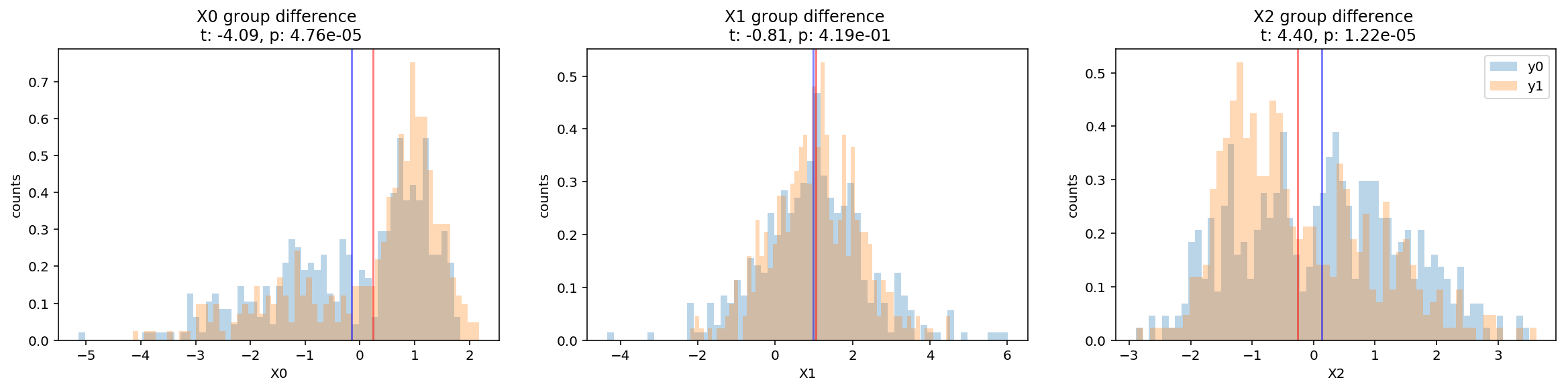
From the histograms showing the means and the results of the t-tests, we can infer that the two variables X0 and X2 show statistically significant differences between the two groups.
But as a more robust test, we fit an explanation model using logistic regression on y from the X variables.
import statsmodels.formula.api as smf
formula = 'y~'+'+'.join(colnames)
mod = smf.logit(formula=formula,data=df_train)
res = mod.fit()
print(res.summary())
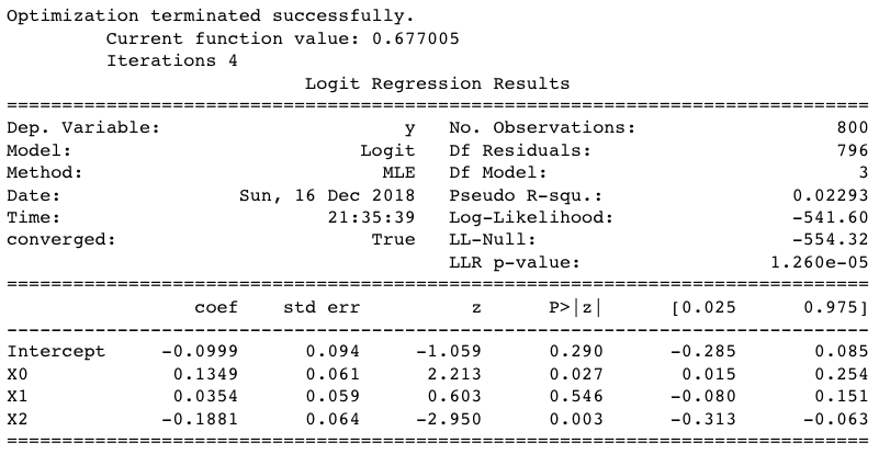
As expected, X0 and X1 came out as significant predictors. Since we have two significant predictor variables, one might assume that we can do reallly well in predicting the y labels as well.
Let’s actually train a model to see if this is the case.
To see if our set of variables can do a good job in predicting the y labels, we fit a logistic regression model once again on the training set but evaluate its prediction accuracy on the test set.
from sklearn.linear_model import LogisticRegression

clf = LogisticRegression(solver='lbfgs')
clf.fit(y=df_train['y'], X= df_train[colnames])
print("Training Accuracy:", clf.score(df_train[colnames],df_train['y']))
mean_score=clf.score(df_test[colnames],df_test['y'])
print("Test Accuracy:", clf.score(df_test[colnames],df_test['y']))
Training Accuracy: 0.58625
Test Accuracy: 0.55
The results indicate slightly better accuracy than chance (50%) but nothing impressive.
Let’s look at what these performance look like graphically in a confusion matrix and an ROC (Receiver operating characteristics) curve.
from sklearn.metrics import confusion_matrix, roc_curve, auc

def plot_confusion_matrix(cm, classes,
                          normalize=False,
                          title='Confusion matrix',
                          cmap=plt.cm.Blues):
    """
    This function prints and plots the confusion matrix.
    Normalization can be applied by setting `normalize=True`.
    """
    import itertools

    if normalize:
        cm = cm.astype('float') / cm.sum(axis=1)[:, np.newaxis]
        print("Normalized confusion matrix")
    else:
        print('Confusion matrix, without normalization')
    plt.imshow(cm, interpolation='nearest', cmap=cmap,vmin=0,vmax=1)
    plt.title(title)
    plt.colorbar()
    tick_marks = np.arange(len(classes))
    plt.xticks(tick_marks, classes, rotation=45)
    plt.yticks(tick_marks, classes)

    fmt = '.2f' if normalize else 'd'
    thresh = cm.max() / 2.
    for i, j in itertools.product(range(cm.shape[0]), range(cm.shape[1])):
        plt.text(j, i, format(cm[i, j], fmt),
                 horizontalalignment="center",
                 color="white" if cm[i, j] > thresh else "black")

    plt.ylabel('True label')
    plt.xlabel('Predicted label')
    plt.tight_layout()

cm = confusion_matrix(y_true = df_test['y'], y_pred = clf.predict(df_test[colnames]))
plot_confusion_matrix(cm, classes=clf.classes_,normalize=True)

The lack of distinction between the cells indicate the poor performance of our model. It accurately predicted the 0 label 54% of the time but only 43% for label 1.
Plotting an ROC curve is a way to illustrate the sensitivity and specificity of the model, where a good model would be illustrated by a curve that diverges farthest from the diagonal line .
y_score = clf.decision_function(X_test)
fpr, tpr, thresholds =roc_curve(y_test, y_score)
roc_auc = auc(fpr,tpr)
plt.plot(fpr, tpr, lw=1, alpha=0.3,label='ROC test (AUC = %0.2f)' % (roc_auc))
plt.legend()
plt.plot([0, 1], [0, 1], linestyle='--', lw=2, color='r',
         label='Chance', alpha=.8);
plt.axis('square');
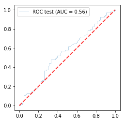
Our ROC line barely separates itself from the diagonal showing its poor performance.
Lastly, since chance alone is not a good indicator of model significance, let’s test how random models would have done compared to other random possible models.
from sklearn.model_selection import KFold, RepeatedKFold
from sklearn.linear_model import LogisticRegressionCV

np.random.seed(1)
kfold = RepeatedKFold(n_splits=5, n_repeats = 5)
n_permute = 200
permuted_scores = []
count = 0
for train_ix, test_ix in kfold.split(X):
    X_train, X_test = X[train_ix], X[test_ix]
    y_train, y_test = y[train_ix], y[test_ix]
    train_df = pd.DataFrame({'y':y_train})
    for permute_ix in range(n_permute):
        count+=1
        if count%100==0:
            print(count,end=',')
        y_train_shuffled = train_df[['y']].transform(np.random.permutation)
        clf = LogisticRegressionCV(cv=5)
        clf.fit(X_train,y_train_shuffled.values.ravel())
        score = clf.score(X_test,y_test)
        permuted_scores.append(score)
train_shuffled_score = np.mean(permuted_scores)
score_percentile = np.mean(mean_score < permuted_scores)
title = f'True score percentile : {score_percentile}'
f, ax = plt.subplots()
plt.hist(permuted_scores,bins=15)
ax.axvline(train_shuffled_score,color='k',linestyle='--',label='Chance')
ax.axvline(mean_score,color='r',linestyle='--',label='True classification score')
ax.set(xlim=[0.1,.9],xlabel='Accuracy (%)',ylabel='Count',title = title)
plt.legend();
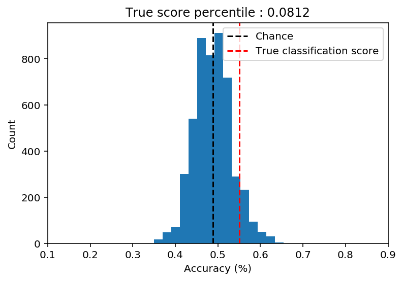
Our better than chance accuracy of 55% turns out to be no better than other random models (p=.0812) where the y labels were shuffled.
What we learned
This above example illustrates how significant variables of an explanation or hypothesis testing model may not guarantee significant performance in prediction. Of course, there will be cases in which significant models actually do provide good prediction but it’s important to keep this simulation in mind that it is not always the case.
Conclusion
Next time your hypothesis testing obsessed friend tells you that he doesn’t need to run a prediction model because his variables are sooooo significant, make sure you show them that their significant variables in the model may not do well at all in predicting outcomes.
machine-learning significance permutations analysis data prediction simulation python