Chance is not enough: Evaluating model significance with permutations

This post was also published in Towards Data Science at Medium
When training a machine learning model for classification, researchers and data scientists often compare their model performance against chance. However, this is often not enough. The true test of significance can be achieved by comparing the model to a collection of models trained on junk labels. If a large number of models trained on junk data can be used just as well to predict above chance, this suggests your model is not significantly better than the junk models. Thus in some situations, it would be wise to compare model accuracy to not just chance but the performance of junk models. In this tutorial, we compare how classification performance that is better than chance may not actually be significantly better than a random model.
Let’s consider a hypothetical study in which we are trying to classify what image participants saw from their brain activity. Participants saw either an image with a happy face (labeled 1) or an angry face (labeled 0) for 10 times each resulting in 20 trials per participant. In this setup, the chance of predicting one condition over the other would be 50%. We generate data for 40 participants (groups) with 60 voxels (features) for 800 trials meaning each participant had 20 (=800/40) trials each. Of those 20 trials, half of them are happy faces and the other half angry faces. All features are randomly sampled from a uniform distribution between 0 and 1 with .5 mean. To give the model useful features for classification, we add a set of random values with the same distribution to every 8th value in the data so that trials 0, 8, 16, and so forth will have higher values that could be leveraged to classify the happy faces.
# Load required packages.
%matplotlib inline
import numpy as np, pandas as pd, matplotlib.pyplot as plt, seaborn as sns, os, glob
import matplotlib.gridspec as gridspec
from sklearn.linear_model import LogisticRegressionCV
from sklearn.model_selection import LeaveOneGroupOut
from scipy import stats

# set random seed for same answers
np.random.seed(1)
n_samples = 800 # Total number of samples
n_features = 60 # Total number of features (~voxels)
n_groups = 40   # Total number of participants
n_features_useful = 10 # Subset of features that would be useful
n_skip = 8 # Every Nth trial that would be infused with slightly usefuly features

# Generate random data
X = np.random.rand(n_samples,n_features)
# Add random values to make every n_skip-th feature useful
X[::n_skip, :n_features_useful] = X[::n_skip,:n_features_useful]+np.random.rand(X[::n_skip,:n_features_useful].shape[0],X[::n_skip,:n_features_useful].shape[1])
# Generate labels
y = np.tile([0,1],int(n_samples/2))
# Generate groups
groups = np.repeat(range(0,n_groups),int(n_samples/n_groups))
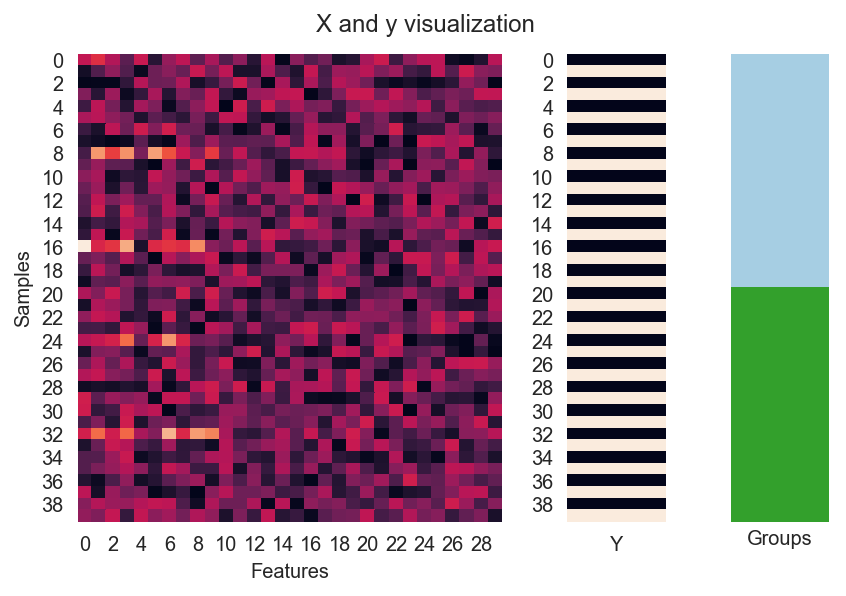
Now let’s visualize a subset of data for two subjects (40 trials). Note the horizontal bright lights between columns which are the features that our model should be able to leverage for predicting the happy faces (dark bars from Y).
# Here we visualize the data
gs = gridspec.GridSpec(1,5)
ax1 = plt.subplot(gs[0, :3])
ax2 = plt.subplot(gs[0, 3])
ax3 = plt.subplot(gs[0, 4])
sns.heatmap(X[:40,:30],cbar=False,ax=ax1)
ax1.set(xlabel='Features',ylabel='Samples')
sns.heatmap(np.array([y]).T[:40],ax=ax2,xticklabels='Y',cbar=False)
sns.heatmap(np.array([groups]).T[:40],ax=ax3,xticklabels='',yticklabels='',cmap=sns.color_palette("Paired",40),cbar=False)
ax3.set(xlabel='Groups')
plt.suptitle('X and y visualization',y=1.02)
plt.tight_layout()
Now we train our predictive model using a logistic regression with leave-one-subject-out cross validation. For every left out subject, we train a new model with built in cross validation to choose the optimal regularization strength (see here for details).
logo = LeaveOneGroupOut()

scores = []
for train_ix, test_ix in logo.split(X,y,groups):
    X_train, X_test = X[train_ix], X[test_ix]
    y_train, y_test = y[train_ix], y[test_ix]
    clf = LogisticRegressionCV()
    clf.fit(X_train,y_train)
    score = clf.score(X_test,y_test)
    scores.append(score)
mean_score = np.mean(scores)
t,p = np.round(stats.ttest_1samp(scores,.5),5)
title = f'Mean accuracy: {mean_score},  Significance from 1-sample test against .5 chance : t = {t}, p = {p}'

ax = sns.barplot(scores,ci=95,orient='v')
sns.stripplot(scores,ax=ax,orient='v',color='k')
ax.axhline(.5,color='r',linestyle='--')
ax.set(ylabel='Accuray (%)',title=title)
plt.show()
Here is the result, with the red dotted line representing chance at 50%.
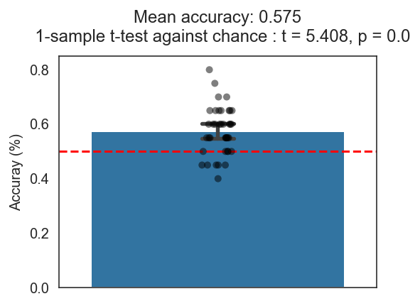
Woo-hoo! Our model from cross validation shows a cross validated accuracy of 57.5% which is significantly better than chance from both a t-test and bootstrapped confidence intervals (95% CI shown in bar plot). Not the best model in the world but still does better than chance so we should be good to publish right?
Not so fast.
It is quite possible that the model is not doing any better compared to any junk model that may arise from the data. A more stringent test would be to compare the model accuracy to a distribution of accuracies from junk models trained on randomized labels. This way you would be able to approximate how much better your model really is compared to trash models.
To build this distribution of accuracies, we train 50 additional models in each cross validation fold ultimately creating a distribution of 2000 accuracies. In each fold, the labels of the training set is shuffled to predict the true labels of the left out subject. The significance score is determined by the number of permutations whose score is better than the true model score.
np.random.seed(1)
logo = LeaveOneGroupOut()
n_permute = 50
permuted_scores = []
count = 0
for train_ix, test_ix in logo.split(X,y,groups):
    X_train, X_test = X[train_ix], X[test_ix]
    y_train, y_test = y[train_ix], y[test_ix]
    train_df = pd.DataFrame({'y':y_train,'groups':groups[train_ix]})
    for permute_ix in range(n_permute):
        count+=1
        if count%100==0:
            print(count,end=',')
        y_train_shuffled = train_df.groupby('groups')['y'].transform(np.random.permutation).values
        clf = LogisticRegressionCV()
        clf.fit(X_train,y_train_shuffled)
        score = clf.score(X_test,y_test)
        permuted_scores.append(score)
train_shuffled_score = np.mean(permuted_scores)
score_percentile = np.mean(mean_score < permuted_scores)
title = f'True score percentile : {score_percentile}'

f, ax = plt.subplots()
plt.hist(permuted_scores,bins=15)
ax.axvline(train_shuffled_score,color='k',linestyle='--',label='Chance')
ax.axvline(mean_score,color='r',linestyle='--',label='True classification score')
ax.set(xlim=[0.1,.9],xlabel='Accuracy (%)',ylabel='Count',title = title)
plt.legend()
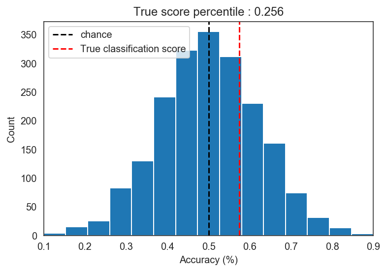
After this procedure we find that our model performance of 57.5% is actually not significantly better than the accuracies from junk models. The percentile p-value of p = .256 suggests that approximately 26% of the models trained on mixed up labels actually performed better than our model.
In scikit-learn, this method is also implemented as permutation_test_score which shuffles both the training and test labels. In some cases, this might generate a tighter distribution than shuffling only the training labels.
np.random.seed(1)
logo = LeaveOneGroupOut()
n_permute = 50
permuted_scores = []
count = 0
for train_ix, test_ix in logo.split(X,y,groups):
    X_train, X_test = X[train_ix], X[test_ix]
    y_train, y_test = y[train_ix], y[test_ix]
    train_df = pd.DataFrame({'y':y_train,'groups':groups[train_ix]})
    test_df = pd.DataFrame({'y':y_test,'groups':groups[test_ix]})
    for permute_ix in range(n_permute):
        count+=1
        if count%100==0:
            print(count,end=',')
        y_train_shuffled = train_df.groupby('groups')['y'].transform(np.random.permutation).values
        y_test_shuffled = test_df.groupby('groups')['y'].transform(np.random.permutation).values
        clf = LogisticRegressionCV()
        clf.fit(X_train,y_train_shuffled)
        score = clf.score(X_test,y_test_shuffled)
        permuted_scores.append(score)
train_test_shuffled_score = np.mean(permuted_scores)
score_percentile = np.mean(mean_score < permuted_scores)
title = f'True score percentile : {score_percentile}'

f, ax = plt.subplots()
plt.hist(permuted_scores,bins=14)
ax.axvline(train_test_shuffled_score, color='k', linestyle='--',label='Chance')
ax.axvline(mean_score,color='r',linestyle='--',label='True classification score')
ax.set(xlim=[0.1,.9],xlabel='Accuracy (%)',ylabel='Count',title = title)
plt.legend()

In our simulated data, we don’t see much difference between shuffling both training and testing labels and shuffling just the training labels.
Conclusion
Here we simulated data to show that comparing model accuracy to chance can sometimes be misleading. A model with slightly better accuracy than chance may not be significantly better than other junk models trained on shuffled labels. However, we should also consider that the number of samples per subject may limit how truly “random” your permuted models can be. For example if you only have 2 samples per subject, then shuffling those will not give you a big distribution of accuracies like you would think.
Here are some papers regarding this matter:
This post has also been published with Towards Data Science on Medium.
machine-learning chance significance permutations analysis data